GÜRKAY AYDOĞMUŞ
DESIGNER


Silver Award 2020

Silver Award 2020
Atatürk Kent Ormanı [Ataturk Urban Forest], hosted by Istanbul Metropolitan Municipality, is a destination point alluring and welcoming the residents with its biodiversity, wildlife, natural beauty and rich flora. In the center of the Istanbul, it embraces a great variety of birds, endemic trees and plants.
TIMELINE
3 months
Feb 2020 - May 2020
TEAM
Gürkay Aydoğmuş
Ezgi Özcan
Koray Gelmez (supervisor)
TOOLS
Adobe Ai, Ps, Pr, Ae, Xd
Rhinoceros
ACTIVITIES
Product Design
Visual Identity Design
UX/UI Design
Challenge
-
To design a system where visitors can get information about the forest and find directions for the newly opened forest.
-
To raise awareness of people by respecting the habitats of the living things in the forest, which is a natural habitat and an important intercontinental bird migration route.
-
To create a friendly and humanist identity for the forest, which is located in the center of the city and is expected to be a frequently visited destination, in harmony with the identity of the city.
Approach
-
Establishing the system by cocreation with the architects, planners, landscapers, regular visitors of the forest, forest and animal scientists, producers and implementers.
-
Developing a sustainable product and system strategy where the highest possible efficiency can be obtained with the least intervention that respects living spaces and natural areas.

RESEARCH & DISCOVERY
Field Visit
Discovering the 1.1km² area
I learned about the entire forest like the back of my hand, meeting nature lovers during field visits, listening to bird watchers' advice on habitat sensitivity, asked regular visitors about their experience. I must say that dozens of visits guided the approach of the project.


ANALYSIS & DEFINITION
Area analysis and component identification
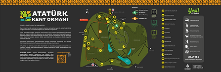
The area covers a large area in the center of Istanbul, between two metro stations, so we started to create a map by simplifying the site plan of the forest.
Considering the social areas, habitats and roads in the forest, we determined the main elements to be included in the system as follows:
-
Direction unit at road intersections
-
Informative unit to be placed at certain intervals where habitat and map information will be included
-
Identification unit for zones and buildings
-
Warning unit where permits and prohibitions are reminded, and in some areas, suggestions in accordance with the concept will be found
-
Entrance unit where overall information will be included at the gates
CONCEPTUALIZATION
Initial product concept & zone definition with digital illustrations
We built the structure with raw wood material that is compatible with the environment and visualized how the product will look with contrast metal sheet and graphic applications. Since we learned from bird watchers that vibrant colors attract the attention of living things and confuse them, we decided to make the metal sheet a dark color.
Since the regions with socialization and natural habitats in the forest are differentiated according to the landscape design, we came up with the idea to make a color code system that will enable us to understand these regions in the elements. We thought of using these codes in strips on metal sheets.


LOGO CREATION
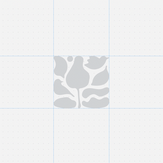
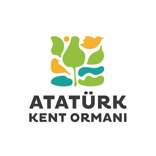
Combining organic shapes to use them in a systematic way
The individual components of the logomark such as sun, birds, trees, leaves, green spaces, and ponds come together and shape a Gestalt with yellow-orange, blue and green, which represent the natural unity of the Urban Forest.
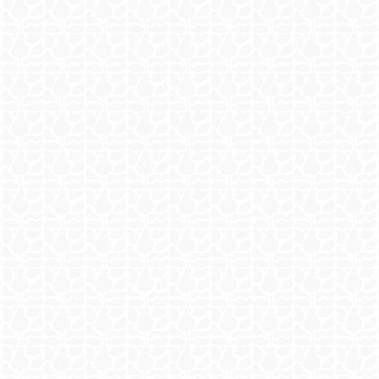
The logomark offers a great flexibility to create various combinations such as patterns, linear separators, zoomed and tilted compositions.
The logotype was justified with the uppercase letters to make a compact composition. The font in use (Pluto) gives a clear impression with its bold geometry. Also, the legs of letters “K” and “R” make the logo more sincere and approachable.
VISUAL COMPONENTS
Icons, illustrations and map drawings
We designed an icon set to be used in various places such as facilities, warnings and extensions, with a soft corner and solid design in harmony with the forest identity and logo.
The creatures living in the forest, the birds passing by while migrating and the endemic plant species make this forest special. For this reason, we have prepared illustrations to be used on information signs.
While bringing together the simplified maps and icons we prepared, we generated QR codes that direct the visitors to their map application to track parkours.


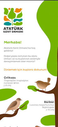

MOBILE INTERACTION
The sound of
nature
Although visitors come to see the birds in the forest, the chances of seeing or hearing them are low. We decided to prepare an interface to bring people together with these bird species. We enabled them to be directed to the mobile web page via the QR code we placed on the signboards and to hear the birds' voices by tapping on the illustrations displayed.
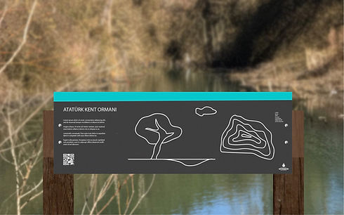
SIGNBOARDS
Preparation for production and printing
Direction unit: We grouped the locations under right, left, forward and backward directions. We have included information about the distance to the entrance, exit and tracks.
Information unit: We created a total of 4 types of signboards: a map sign with information and warnings about the forest, and signs giving information about forest birds, waterfowl and plant species.
Identification unit: We kept the text area vertical and used the logotype as an extension of the zone defining stripe.
Warning unit: In addition to warnings and advice about nature, we aimed to keep his memory alive by including the words of Atatürk, the founder of the Turkish Republic, who gave the forest its name.


EXTENSION
Brand extension and implementation
The extensions of the identity can be seen on patterns, tags, catalogues, promotional items such as tote bags, aprons, notebooks etc.


Thank you!

Product Design
Totem
